
 Healthcare SEO
 PPC & Google Ads
 Website Design
 Content Marketing
 Reputation Management
Urgent Care Website Design: Online Check-In, Wait Times and Conversions

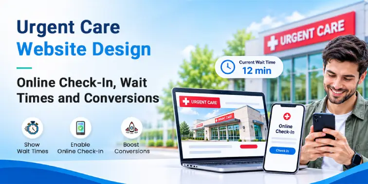
An ankle rolls at seven in the evening. A patient searches on a phone, compares three nearby centers and settles on one in under a minute, often without calling anyone first. This post covers the page layout, the wait-time display, the check-in flow and the privacy-safe measurement that turn that search into a visit, and it is the execution layer of the wider how to market an urgent care playbook.
What Do Patients Need in the First Five Seconds?
- Open-now status with today’s hours and any holiday exception
- The current wait time, beside the time it was last updated
- Street address, parking notes and a one-tap directions link
- The insurance plans and payment options accepted at that location
- A tap-to-call button within thumb reach, with a check-in start button next to it
Lifting those operational facts above a large brand image is a design decision rather than a content one, and the recurring layout mistakes are catalogued in essentials of medical website design.
How Should Wait Times and Online Check-In Work Together?
- Ask the reason for the visit with buttons for common walk-in reasons rather than a free-text box.
- Collect only what the front desk needs to prepare a chart.
- Show the estimated wait and let the patient choose text or call updates.
- Confirm the arrival window and what happens at the desk.
- Send a confirmation with the address, parking and what to bring.
- Update on a schedule the practice can keep, such as every fifteen minutes while open.
- Show the time of the last update beside the figure.
- Publish a range when a single number cannot be held accurate.
- Remove the wait time entirely when the location is closed.
A confirmed check-in is one step in a longer path, described in from browsing to booked appointments, and the details it collects follow the same rules as Health Insurance Portability and Accountability Act (HIPAA)-compliant patient intake forms: encrypted transmission, limited fields and a plain explanation of how the information is used.
Which Pages Does an Urgent Care Site Need?
| Page type | What it must show | The conversion it wins |
|---|---|---|
| Service page | What is treated, in plain words, plus hours, wait time and a call button | Symptom-led searches, such as a suspected sprain or a cut that may need stitches |
| Insurance and payment page | Plans accepted, self-pay options where published and occupational health billing | The cost question that sends a patient to another center |
| Location page | Address, map, hours, parking, directions, wait time and tap-to-call | Near-me and open-now searches |
| Check-in page | Short form, wait estimate, arrival window and confirmation | The patient already on the way |
How Fast Does a Mobile Site Need to Be to Convert?
Urgent care searches happen on a phone, often on a weak connection. Google publishes the thresholds it uses to judge page experience: Largest Contentful Paint within 2.5 seconds, Interaction to Next Paint within 200 milliseconds and Cumulative Layout Shift below 0.1, as set out in its Core Web Vitals guidance.
- Serve one compressed hero image instead of a slideshow, so the headline is not delayed
- Load third-party scripts after the main content renders
- Reserve space for banners and chat widgets so the layout does not jump mid-tap
- Test on a mid-range Android phone on a throttled connection, not on office wi-fi
Click-to-call is the highest-value tap on the page, and its placement follows the patterns in best calls to action for healthcare websites. Speed is also a crawling question, because heavy scripts and blocked resources slow indexing, which belongs in technical SEO.
What Do Accessibility and Privacy Requirements Mean for Site Builds?
A patient may be reading one-handed, in bright light, in pain or on behalf of an older relative, so accessibility is a build requirement. The World Wide Web Consortium (W3C) sets the level to build against in the Web Content Accessibility Guidelines (WCAG) 2.2.
- Contrast strong enough to read outdoors, with text that resizes without breaking the layout
- A visible label on every form field, and error messages that say what to fix
- Full keyboard navigation, including the check-in form and the call button
Privacy starts at the form. Pages that collect or reveal patient information, such as check-in, intake, symptom checkers and portal logins, must not carry third-party advertising or analytics tags that transmit those details. Use of Google Analytics, Google Ads, Google Tag Manager and Meta pixels is non-compliant because these companies do not sign Business Associate Agreements (BAAs) with covered entities. A tag audit belongs in the build rather than after it, as covered in making a website HIPAA-compliant and accessibility and HIPAA design.
Advertising built on website data carries its own limits. Google’s healthcare and medicines advertising policy, together with its Health in personalized advertising policy, treats health as a sensitive interest category that blocks advertiser-curated audiences, while Meta’s Privacy Violations and Personal Attributes standard bars ads that assert or imply a person’s health condition.
How Do You Track Conversions on an Urgent Care Website?
- A tracking number per channel for calls placed from the site, with every call counted as a conversion
- Direction requests and map clicks recorded as events on location pages
- Check-in starts and completions recorded as page events, never by capturing field values
- Form completions logged as counts, with submitted content stored only in the practice’s own systems
The same discipline runs through conversion optimization work, and the campaign-side version of these limits sits in social media advertising for urgent care clinics.
How to Win at SEO for Urgent Care Near-Me Searches?
Proximity decides most near-me results, and proximity is dense: 78% of the United States population lives within a 10-minute drive of an urgent care center, according to the Urgent Care Association industry white paper. The website’s job is to make one location the closest, most open and most prepared answer.
- One page per location with its own address, hours, phone number and parking detail
- Local business structured data matching the Google Business Profile, opening hours included
- Holiday and temporary hours updated in both places, because a mismatch pushes the location down
- Internal links from service pages to location pages
Generative search rewards the same clarity, though the evidence is often misquoted. A Princeton-led study presented at the 2024 Association for Computing Machinery Special Interest Group on Knowledge Discovery and Data Mining (SIGKDD) Conference on Knowledge Discovery and Data Mining measured up to 40% gains in a content-extractability proxy, meaning position-adjusted word count and visibility, under controlled test conditions rather than guaranteed traffic or rankings, as recorded in the published paper on generative engine optimization. A think-aloud study of people using Google artificial intelligence (AI) Overviews, ChatGPT and Alexa for health questions found participants often skipped the AI summary to read the standard results, so the page still has to serve a person first.
Key takeaways
- Answer open now, wait time, address and insurance on the first screen.
- Keep a tap-to-call button visible beside online check-in.
- Publish wait times with an update time, and remove them when the location is closed.
- Build one page per location, plus plain-language service pages for walk-in reasons.
- Test the mobile site on a mid-range phone and a throttled connection.
- Track calls, check-ins and direction requests without capturing patient details.
Next Step: Work With an Urgent Care Marketing Agency
The website is the front door of the whole patient-acquisition system, and paid demand aimed at a slow page wastes budget, which is why urgent care advertising performs best after the build fixes land. The urgent care marketing agency team at Sinopia treats the location pages, the check-in flow and the tag setup as one project, so calls and check-ins can be counted while patient information stays inside the practice’s own systems.
Rebuild the front door of the practice Sinopia plans the location pages, the check-in flow and the privacy-safe tag setup an urgent care site needs, then reports calls, check-ins and direction requests without holding patient data. Contact the team.
Frequently Asked Questions
Q1. What should an urgent care website include?
An urgent care website needs open-now status with today’s hours, the current wait time, the address with directions, the insurance and payment options accepted, and both a tap-to-call and a check-in button visible without scrolling. Behind that first screen it needs one page per location, service pages written in plain words for walk-in reasons, a short check-in form and a privacy notice explaining how submitted information is used.
Q2. How does online check-in affect urgent care volume?
Check-in adds a path for patients who will not phone ahead and shortens the queue on arrival, so its clearest effect is on how many searches become visits rather than on total demand. Uptake is uneven: in a mixed-methods study of primary care patients, 45.11% knew online booking existed while 15.61% had used it, as reported in research on online appointment booking. Portal habits show the appetite is real, with 61.3% of survey respondents having accessed an online medical record or patient portal in the previous 12 months, per a national survey analysis. Keep the phone route on every page alongside check-in. The check-in vendor needs a BAA, texting needs consent, and confirmations shouldn’t mention the reason for the visit.